I agree with John Key and Steven Joyce on a couple of points they stressed to the party faithful gathered in Wellington for their recent election year conference.
Yes, as John Key argued, this election will be closer than many people realise.
And, yes, National should be worried given that, as Steven Joyce made clear, National’s polling this time around is no better – and possibly worse – than it was this far out from the 2011 election.
It’s worth remembering that in 2011 National gained a record 47.3% of valid votes cast, the Labour Party had its worst MMP result (27.1%) and yet, despite pre-election predictions, the National-led government that formed could only scrape together a bare majority.
But, despite agreeing with Key and Joyce’s prognosis for National’s chances in the upcoming election, I disagree over their diagnosis of the causes of their worrisome predicament.
Complacency?
Glass ceilings can be deceptive.
You can see through them, and beyond, to an enticing realm of future possibilities. Yet, try as you might to get to that realm something unseen and unacknowledged keeps stopping you.
The experience is like banging your head against a brick wall that you can’t see.
In that situation, it’s tempting to think that lack of progress is to do with something you have control over rather than a structural limitation.
I think National and its supporters are in just this situation.
And they think that in 2011 (and potentially this year) the barrier to further electoral progress was (and is) supporter complacency – a barrier that sounds like it could be shattered, with enough effort.
There’s quite a few reasons, though, why I think a ‘war on complacency’ is unlikely to be National’s saviour.
Then again, talk of it may well be.
But, first, let’s have a closer look at the supposedly worriesome statistics cited by John Key and Steven Joyce in an attempt to exorcise the complacency demon.
The word was out before the conference that the “danger of complacency” would be a “key message” at the conference.
And, sure enough, when the conference came, according to John Armstrong, John Key and his fellow cabinet ministers were intent on making the recent party conference a “Complacency Free Zone“.
It seems National’s “stellar” performance in opinion polls could – mysteriously – be their undoing and if you don’t believe it just look at turnout in true blue National seats in 2011. Or something like that.
Actually, I don’t think it’s quite like that.
But, back to Armstrong:
The first day of National’s annual get-together had one purpose and one purpose only – eradicating even the merest hint or whiff of complacency ahead of the coming election campaign.
…
From the Prime Minister downwards, speaker after speaker issued warnings to the 600 or so delegate of complacency born of National’s stellar opinion poll ratings.
…
such was the constant hammering of this message that Wellington’s Michael Fowler Centre should be a Complacency Free Zone by the time the conference winds up
Apparently, National’s campaign manager Steven Joyce is under the impression that National’s close squeak in 2011 – despite the Labour Party having its worst poll result in decades – had something to do with its supporters aping their leader’s trademark ‘relaxed’ attitude to winning:
Mr Joyce, a senior cabinet minister, urged delegates to disregard polls which are showing National well ahead of Labour.
…
“Don’t take any comfort from the polls, because you can’t.”
National won 47.3 per cent of the party vote in 2011, its best-ever achievement, and Mr Joyce said it had to aim for at least 48 per cent this time.
“In 2011 too many people thought it was a foregone conclusion and went to the beach,” he said.
On November 26, 2011 it was apparently standing room only on the beaches around the North Shore (I’m not an Aucklander but it sounds like there should be some beaches there), East Coast Bays, Bay of Plenty, etc. as potential National Party voters sunned themselves while smugly happy at the prospect of another three years of John Key.
But the allure of beaches, barbies, beers and anticipatory slaps on sunburnt backs foreshadowed near defeat – or so the National Party faithful were told by Minister after Minister at the conference.
What’s the evidence that complacency – rather than something else – brought National close to the brink of defeat in 2011?
Ultimately, the answer will never be conclusive since a survey of those non-voters in some National seats in 2011 was not done. Alas.
Still, that therefore leaves the door open for speculation – by Key, Joyce … and me. Maybe we can at least get to some ‘balance of probabilities’ answer.
If for no other reason than getting a few interesting statistics into the public arena, I’ll have a play with variations on the notion that National’s turnout somehow disadvantaged it, electorally, bringing it to the brink of defeat.
Then I’ll argue that there’s another way of interpreting the minimal lift that happened in the National Party vote between 2008 and 2011. That interpretation turns out to be far more worrying for National than any fabled ‘complacency’ demonstrated by its supporters.
The story – as reported in the media, at least – is a bit muddled and ambiguous about the arguments used to eradicate complacency. It seems that John Key and Steven Joyce had some worrisome statistics about turnout in National Party strongholds.
The Numbers Game
Armstrong again:
Both John Key and Steven Joyce – National’s election campaign guru – made a point of stressing that Labour did not have a monopoly on the so-called “missing million” – the number of no-shows at the last election.
To the contrary, ten of the 12 electorates recording the biggest drops in turnout between the 2008 and 2011 election are currently held by National.
So concerns over complacency arose because “ten of the 12 electorates recording the biggest drops in turnout” were National seats?
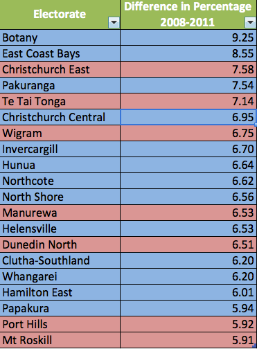
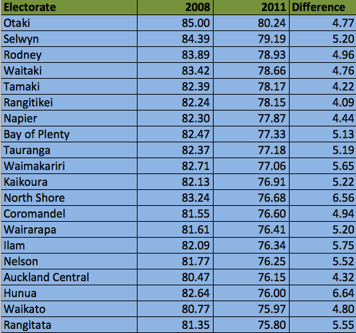
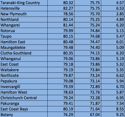
Here’s a Table of the top twenty ‘losers’ (in percentage point drops) between 2008 and 2011. I’ve calculated them purely on the difference in the percentage turnout figures for each electorate between the two elections. [From now on all figures and calculations are directly from, or calculated from, information on the election results website]:
As can be seen, only 8 of the ‘top’ 12 are National Party held electorates.
Given that in the 2011 election National gained 42 electorate seats and Labour only 22 this doesn’t seem too unexpected. And ‘8’ isn’t ’10’. [Also, call me parochial and a stick in the mud, but after living in Christchurch for most of my life I still recoil from the notion that Christchurch Central is a National electorate – but, for now, it is. Of course, it’s reduction may align with that in Christchurch East and so could be a special case.]
Perhaps John Armstrong misheard or miswrote or maybe Te Tai Tonga wasn’t included in National’s list of the top 12 ‘losers’ for some reason.
Nevertheless, there are some substantial reductions in turnout in some very ‘blue’ seats. Botany and East Coast Bays are particular ‘stand outs’.
Yahoo also seemed to report the worrying statistic vaguely, perhaps even incorrectly:
He told 600 delegates that in 2011 voter turnout dropped in 12 of National’s seats.
That is hardly news.
Put simply, turnout dropped in a lot more than 12 of National’s seats. In fact, it dropped in every electorate.
The smallest reduction in turnout percentage between 2008 and 2011 was in Te Tai Tokerau – the percentage turnout figure there dropped by only 1.65 percentage points (from a low base). But it still dropped.
So, what did John Key and others actually say about turnout in National’s true blue seats in 2011?
Radio New Zealand, thankfully, just quoted John Key:
John Key told delegates that despite National’s high polling, support only counted if it was registered at the ballot box.
He said members shouldn’t take it for granted that it was only left leaning voters who didn’t turn out to vote, using the last election as an example.
“In the ten safe National seats where many people obviously thought it was a foregone conclusion, turnout fell by more than six percentage points compared to 2008 – and if that happens again we could easily find ourselves on the opposition benches.”
This seems more likely to be what was claimed. If we assume that when Key said turnout “fell by more than six percentage points” he – or his researchers – were referring to the percentage turnout figures in each electorate between 2008 and 2011 then this may well be true.
In the table above, there are 12 National held seats (though not the ‘ten safest’ or where the result was always a “foregone conclusion” – Christchurch Central??) that had percentage turnout drops of over 6 points.
But, it still leaves the question of just what was meant by Key when he referred to “the ten safe National seats“.
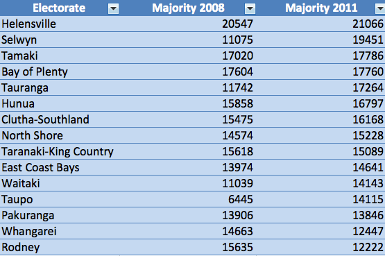
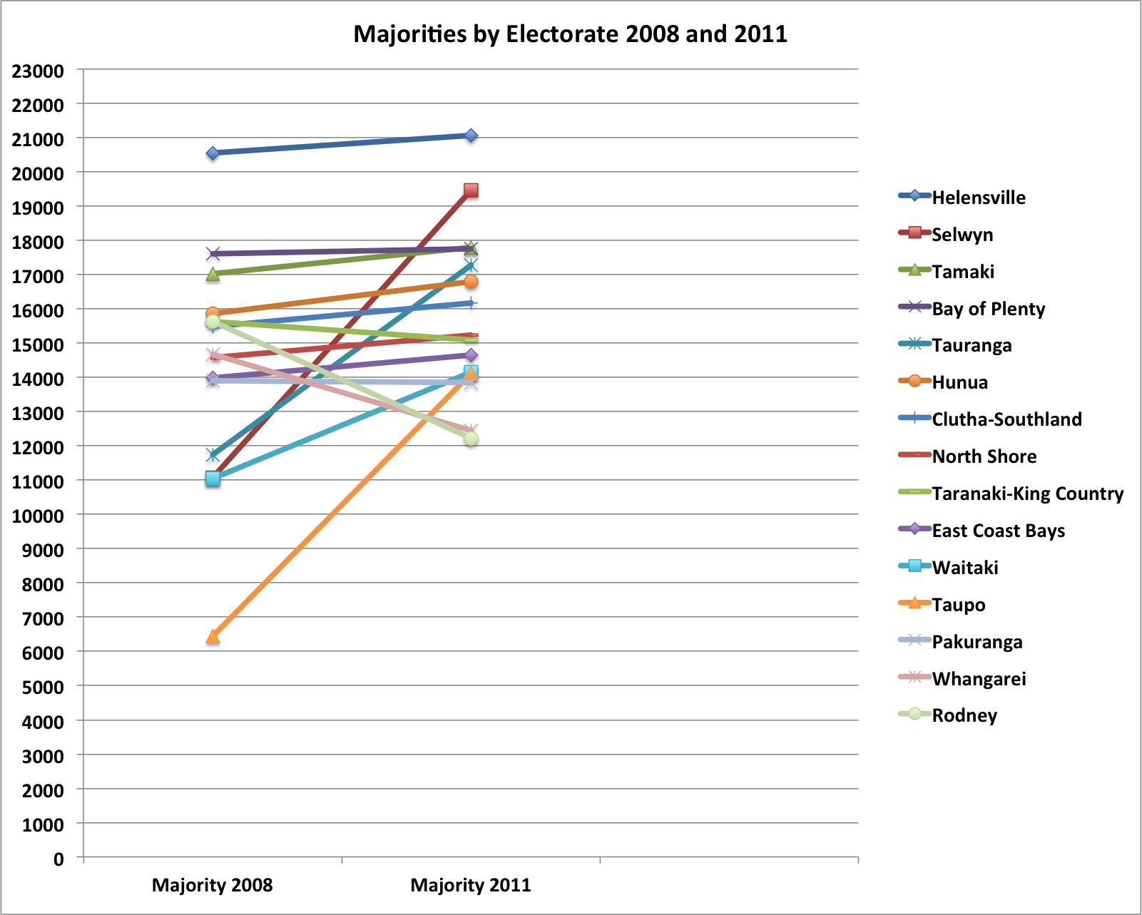
It’s a little bit of First Past the Post thinking, I suppose, but if Key was referring to the ones with the largest National electorate majorities then the next table (and graph) presents the fifteen electorates with the largest National majorities in 2011 (corresponding majorities in 2008 are also provided).
It’s interesting to see that, within the top ten, in all cases bar one (Taranaki-King Country), and despite the Prime Minister’s worries, the National Party majority actually increased between 2008 and 2011 (sometimes hugely as in the case of both Selwyn and Tauranga).
Lower down the ‘safe’ list there were some significant decreases in majorities: Whangarei’s majority (14th safest electorate for National) reduced from 14,663 to 12,447; Rodney’s majority (15th safest) reduced from 15,635 to 12,222.
But there was also Waitaki’s (11th safest) increase from 11.039 to 14,143 and Taupo’s (12th safest) massive increase from 6,445 to 14,115.
Overall, if this is any indication of what happens to National majorities with lower turnout then perhaps John Key should be hoping for huge reductions in turnout in National’s true blue seats?
But, as I intimated, FPP thinking is not really what matters for election victory in an MMP environment so for the rest of this post I’m (mis?)interpreting the Prime Minister’s dire warnings as referencing the electorates in which the National Party party vote was greatest, rather than the electorate majority.
It is the party vote in ‘true blue’ seats that National should be worried about losing through ‘complacency’. This seems to be the argument – where National is thought to be particularly strong, turnout is lowest.
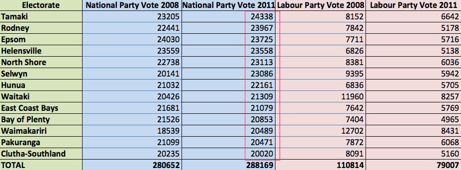
On that basis, here’s a table (and graph) of the thirteen electorates with the highest National Party party vote in 2011. I chose thirteen simply because that involves party votes of 20,000 or more.
You’ll notice that it incorporates all but two of the top ten ‘safe electorate seats’ and seven of the 12 National seats that had the biggest reductions in percentage turnout.
Over these thirteen electorates the National Party vote increased by 7517 votes. By comparison, the Labour Party vote over those same electorates decreased by 31,807 votes between 2008 to 2011.
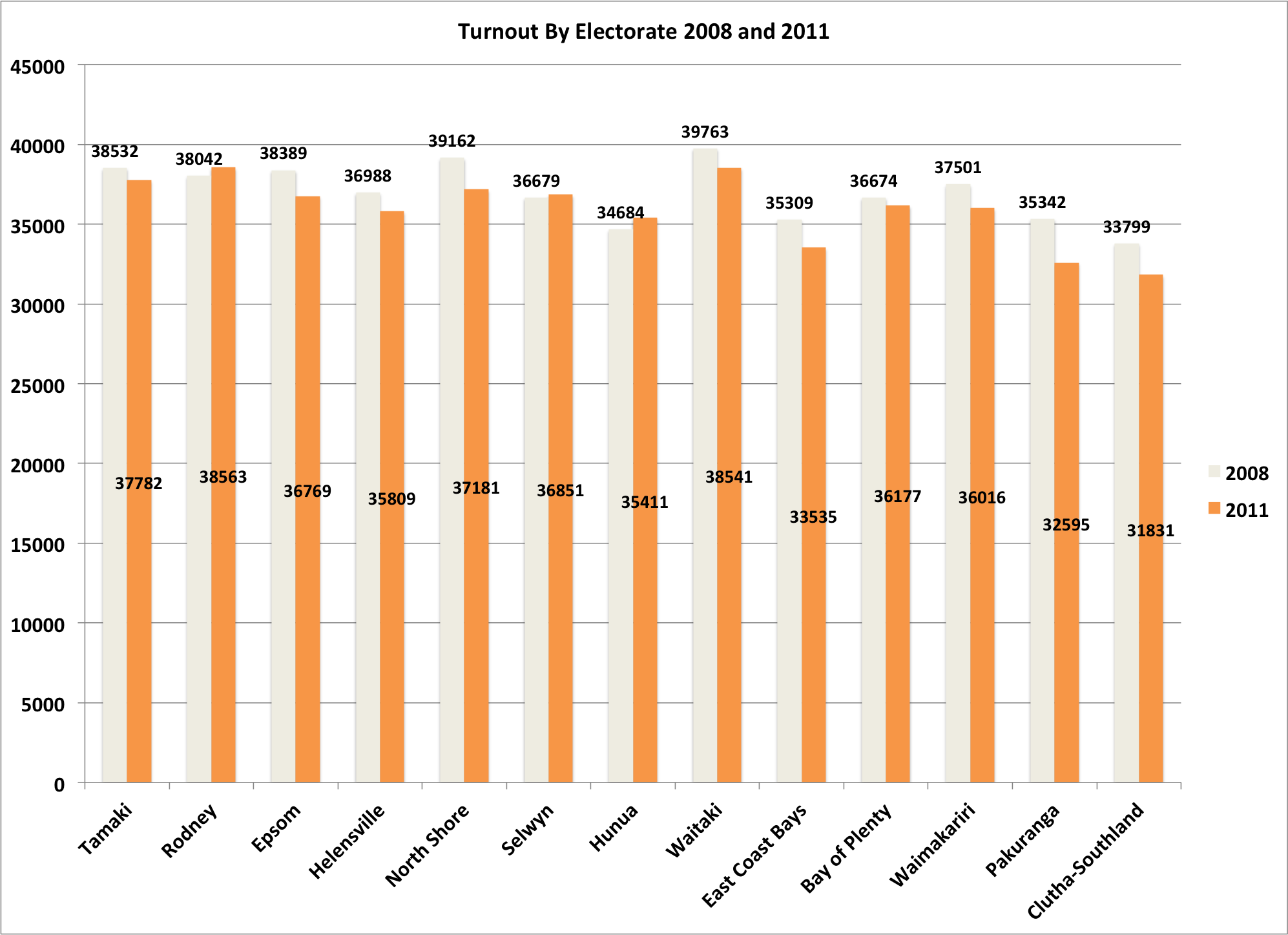
It’s true, though, that the overall turnout in those 13 electorates – even in absolute number of votes, not just percentages of registered voters – declined between 2008 and 2011 as seen in this graph:
But it’s equally true that a decline in the National Party vote was not the cause.
Any complacent, beach-going National non-voters – whatever their number – did not cause the absolute number of National votes to decline overall.
Arguably, however, – and entirely speculatively – they may have still constrained some expected increase in National votes – e.g., an expected increase that comes from extrapolating the increase in registered voters and/or based on pre-election poll ratings (more on the latter, later).
Is there any way to get more understanding of the relative performance of the National vote in these two elections?
For a finer grained view of the voting patterns in these thirteen electorates, here’s the National Party vote in 2008 and 2011:
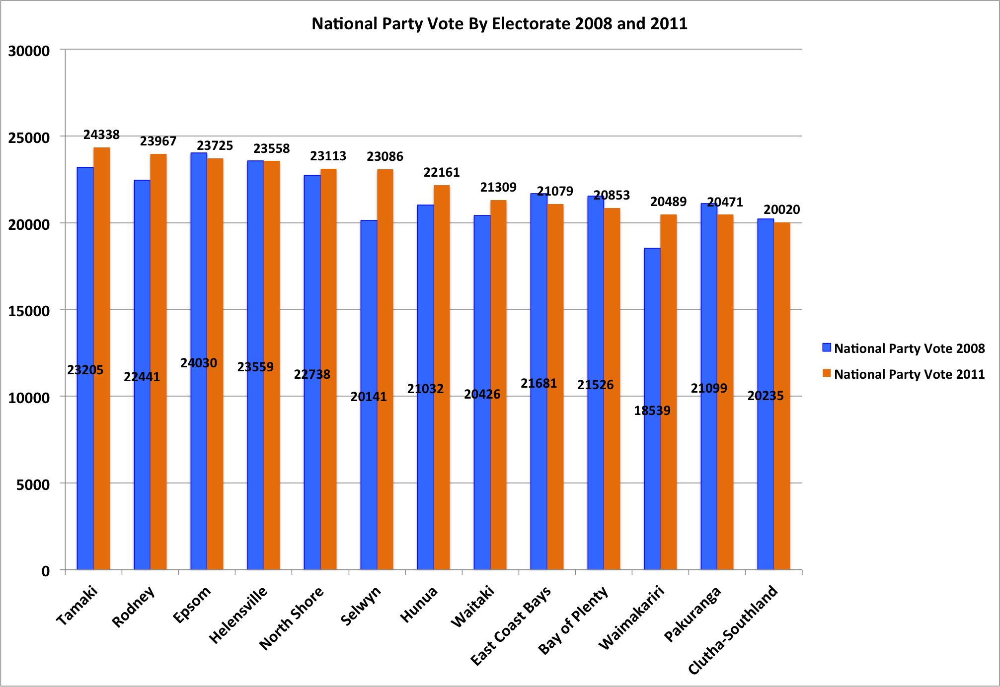 The National vote decreased in six of the thirteen electorates (in Helensville, only by one vote). It increased in seven electorates – markedly in Selwyn and Waimakariri (something happened in the juggling of the population in Canterbury electorates that year, perhaps?).
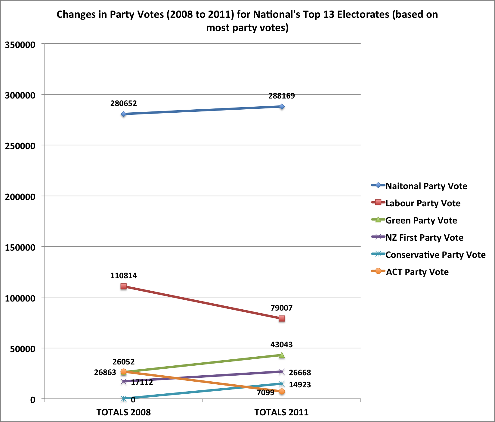
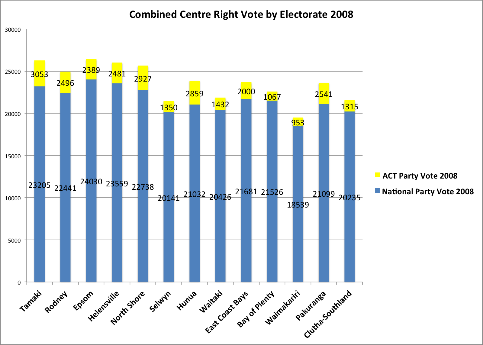
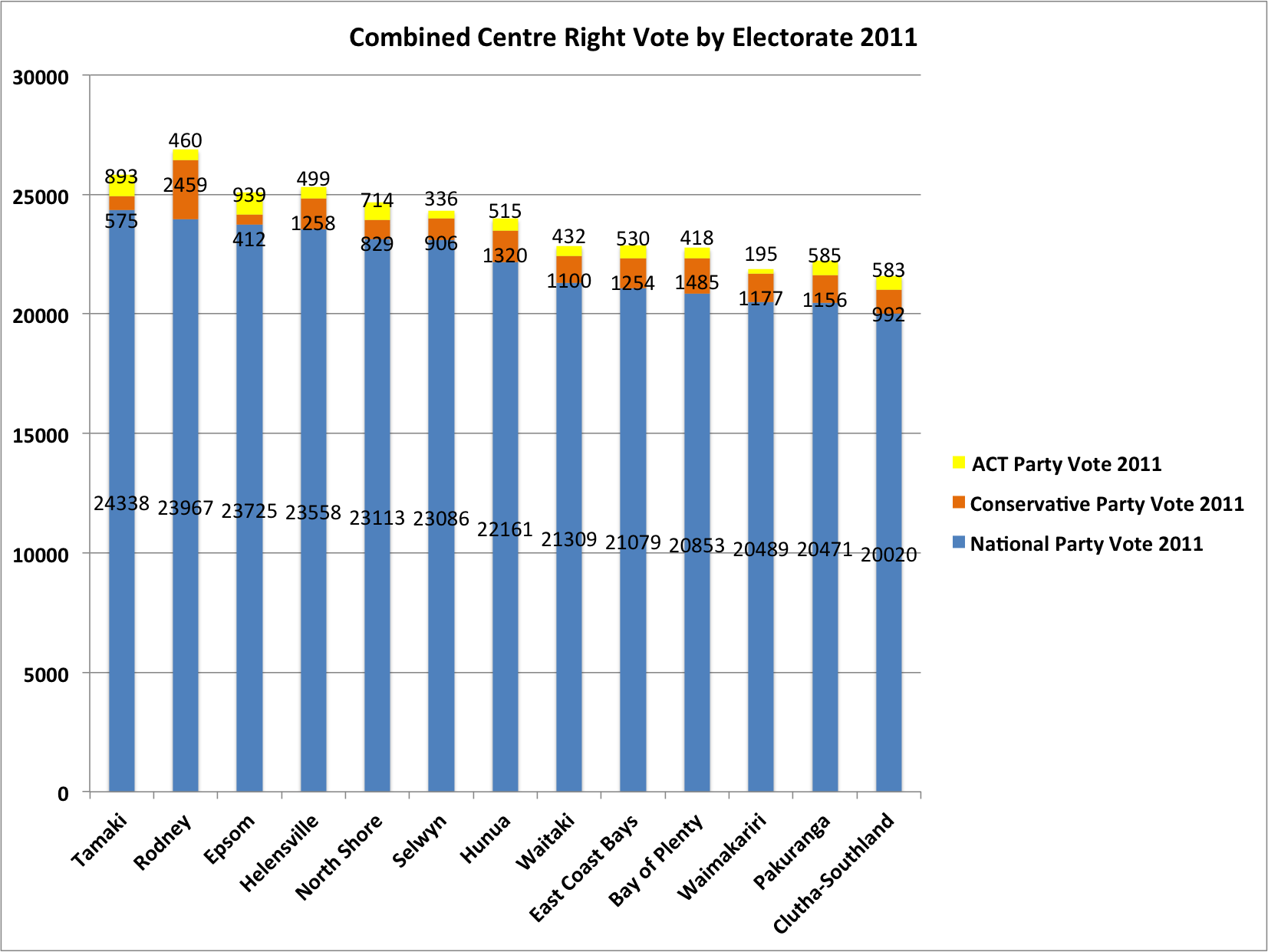
In aggregate, the following graph shows which parties were likely most responsible for the decline in absolute number of votes cast between 2008 and 2011 in these ‘top thirteen’ seats.
Only two of these parties received fewer party votes across the thirteen electorates in 2011 than they did in 2008. As mentioned, Labour lost 31,807 votes but ACT also lost 19,764 votes. That’s a total loss of 51,571 votes.
The ‘winners’ between 2008 and 2011 in terms of absolute votes were National (+7,517), the Green Party (+16,991), New Zealand First (+9,556) and the Conservative Party (+14,923 – they were not formed in 2008). That’s a total increase of 48,987 votes.
Overall, there was therefore a drop of 2,584 votes cast for all these parties across the thirteen electorates between 2008 and 2011. Not huge in absolute terms but more significant given the increase in the registered voters in the thirteen electorates between 2008 and 2011.
For these electorates, voters on the electoral roll went from 590,125 in 2008 to 619,177 in 2011. That’s an increase of 29,052 voters, or a 4.9% increase.
By comparison, the National Party’s vote increased from 280,652 to 288,169, or 2.68%. So, the increase was less, in percentage terms, than the increase in the electoral roll for those electorates.
This represents some evidence that expected votes for National from the increased size of the electoral roll did not turn out at the booth – there’s a ‘missing’ 2.22 percentage point increase (4.9-2.68=2.22).
That 2.22 percentage point difference translates to about 6,230 votes across thirteen electorates (479 votes for National per electorate).
There’s also some reason, based on pre-election polling, to believe that the ‘shortfall’ for the National vote in these electorates was even greater than could have been expected.
In 2008, polling (nationwide) just before the election suggested National would get 46.4 + or – 2.5% while the same polling prediction for 2011 was 51 + or – 2%. That is, the polling suggests about 4.6 percentage points more for National in 2011 than in 2008.
The 2008 election result for National, at 44.6%, was within expectations.
At 47.3% the 2011 result, by contrast, was 1.7 points outside expectations.
But this approach that emphasises ‘expectations’ tends to underemphasise a couple of important points. First, National’s actual vote still increased in its true blue seats between 2008 and 2011 even if not to the extent that the electoral roll grew in those seats.
Second, and most importantly, the fact that National’s vote grew in actual numbers means that the reduction in turnout at the electorate level (which was 6+% in many of these electorates) advantages National relative to any party whose vote reduced.
That is, getting a larger piece of the pie when the pie is shrinking increases the proportion of the pie gained, relative to those whose piece of pie has shrunk even more rapidly than the shrinking pie. In a competitive setting, it’s a ‘double whammy’ of an advantage.
But of course there are more than two parties in these contests: while the Labour Party may have been the major loser of absolute numbers of votes in these electorates (followed by ACT) the Green Party markedly increased its vote (more than National, in absolute terms)
Given that, it perhaps makes sense to look at the electoral changes in these electorates after combining both the ‘Centre Right’ and ‘Centre Left’ votes.
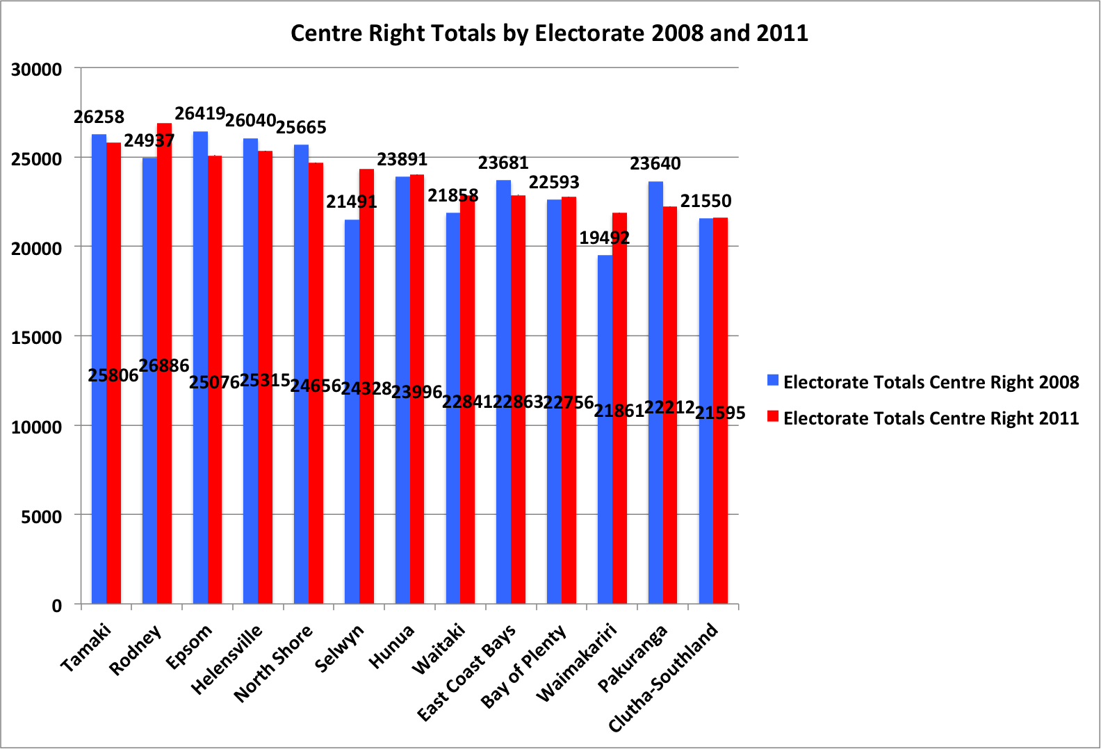
Taking a ‘conservative’ approach to the centre right bloc, in 2008 it comprised National and Act and in 2011 it comprised National, Act and the Conservative Party. (New Zealand First is left out of this ‘bloc’ but it’s worth noting that if it were included that would increase that bloc’s proportion of the vote in 2011 even more since the New Zealand First vote increased noticeably in these electorates.)
The graphs show that, in absolute number of votes, the total for the centre right shrank in six of the electorates and expanded in seven of the electorates. Swings and roundabouts.
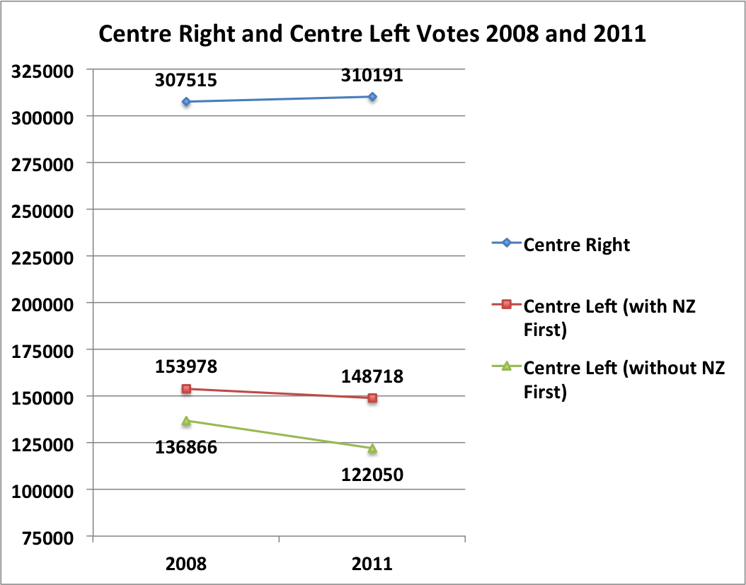
And, in much simpler form (below), across the thirteen electorates there’s a marginal increase in the Centre Right vote of 2,676 votes between 2008 and 2011 (see graph below).
That compares with a reduction in the Centre Left vote of 5,260 (if the Labour Party, the Green Party and New Zealand First are included) or 14,816 (if only the Labour Party and the Green Party are included).
Even in combination, then, the centre right fared better than the centre left in these electorates when it came to the vote count, irrespective of turnout percentage.
There may be some National-leaning non-voters on the better beaches on polling day but it’s likely – at least suggestive – that they were jostling for beach towel position with rather more centre left voters (the apocryphal no-show Green voters, for example – the Green Party, despite its increased vote, also under-performed relative to pre-election polling).
It’s getting harder and harder to find a way of looking at the numbers that supports the worries about ‘complacency’ that John Key and other Ministers dwelt upon at the National Party Conference.
Of course, all parties should try to get their voters to the polls. But the idea that complacency in National strongholds jeopardised the National Party’s electoral chances in 2011 – or that of the ‘right’ more broadly – seems hard to justify.
That becomes clearer when percentages, rather than absolute numbers, are used. And it was percentages that Key and Joyce relied upon to make their case.
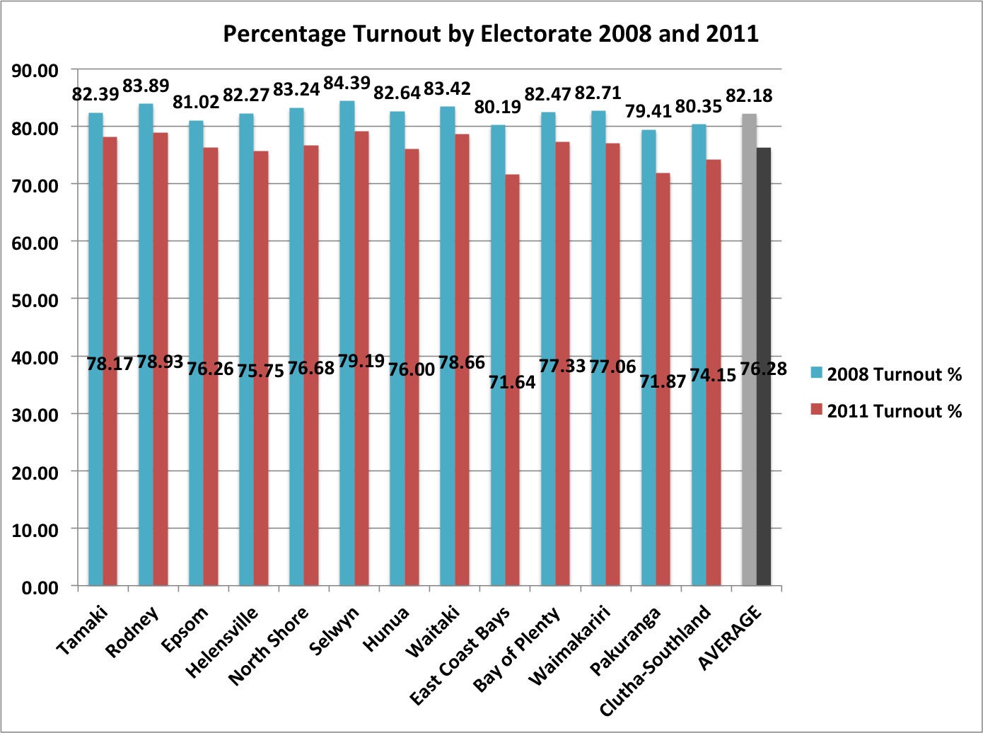
Here’s two more figures, then, based on a look at the percentages in these thirteen true blue electorates. The first simply shows the percentage turnout in 2008 and 2011 for each electorate and the average turnout over all the thirteen electorates (the columns in grey and black on the right):
This is where the magic figure of a 6% drop in turnout in National’s blue ribbon seats presumably comes from (with these thirteen electorates the average reduction is 5.9%, so it’s close enough).
Yes, turnout went down in these electorates – in East Coast Bays by 8.55 percentage points and Pakuranga by 7.54 percentage points. So, is that a worry for National?
No. In some ways, it was quite the reverse. At least for these electorates.
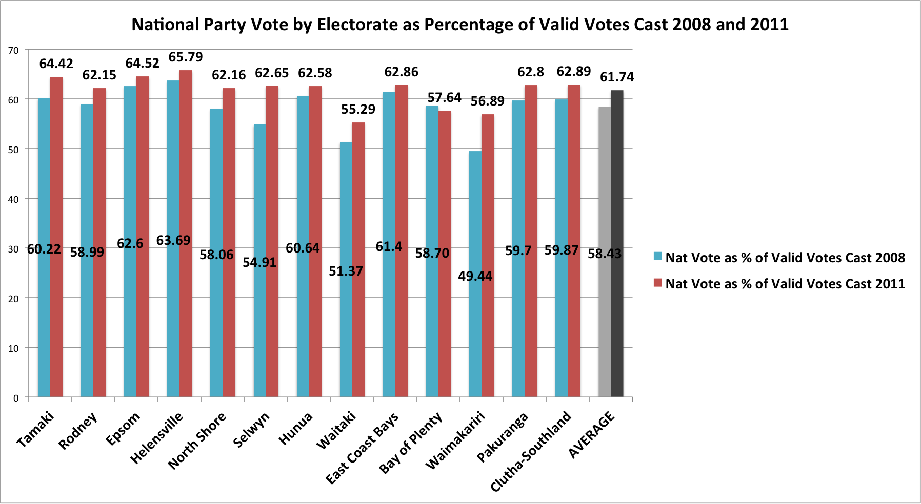
When the contribution these electorates made in 2011 to the national result is averaged, it turns out that they performed better than they did for National in 2008 – just because, irrespective of turnout, a greater proportion of that vote went to National in 2011 than it did in 2008.
Despite turnout decreasing by 5.9 percentage points, on average, across the thirteen electorates that delivered National its largest party votes, the percentage of valid votes that National gained increased, on average, by 3.31 percentage points.
And this is the figure that matters in an MMP environment.
Lower turnout in these true blue National Party strongholds went side-by-side with an increase in the proportion of the vote National received from them.
The logic is simple.
Yes, National may have received fewer votes than they felt entitled to given an increased electoral roll in these electorates and pre-election polling that suggested a higher percentage for National than it did in 2008.
But, on the latter point about pre-election polling it has to be remembered that such polling was carried out nationwide and so shouldn’t necessarily be the basis for hopes of improvement – compared to 2008 – in a sub-set of (blue ribbon) electorates that always perform well above the national average for National. That is, there’s no particular reason to believe that higher nationwide pre-election polling for National in 2011 as compared to 2008 is partly a result of gains in these already high-polling seats.
The polling gains may have come from other, less true blue, electorates in large part. It’s a bit like the law of decreasing marginal returns – where support for National is close to saturation point it’s unlikely to produce a marked improvement; where support for National has room to improve, there’s more likelihood for larger increases in support.
Further, even if these electorates returned fewer party votes to National than National expected or wanted, these electorates nevertheless delivered in 2011 a greater advantage to National in respect to the overall, nationwide result than they did in 2008.
That’s simply because, through whatever mechanism, fewer actual votes for the left (and Labour in particular) came from these electorates in 2011 compared to 2008, while there were more actual votes for the right (including National).
There’s one caveat to this. The party vote at an election is summed across the country and across all electorates. If National/Right-leaning electorates, overall, had lower turnout or larger reductions in turnout than Labour/Left-leaning electorates there’s still the theoretical possibility that National’s vote suffered disproportionately from that low turnout in ‘safe’ National seats.
Notice, though, that Key and Joyce emphasised performance in ‘safe’, true blue seats rather than all electorates in order to make their point about complacency. That is, they didn’t argue that, overall, turnout was lower in National seats than other seats.
So what was turnout like across the country?
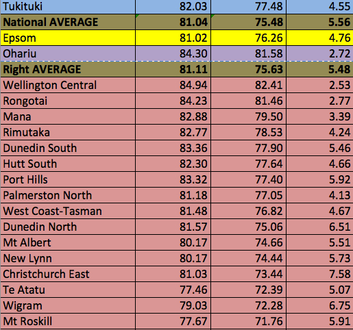
Here’s all the electorates listed by party affiliation (colouring) and the turnout percentages in 2008 and 2011 and the drop in turnout between those elections. I’ve also included averages for (1) National seats, (2) all right-held seats (i.e., including Ohariu and Epsom with National seats); and, (3) Labour seats. In doing this averaging of each party’s electorate turnout I excluded the Maori seats as their turnout figures are historically much lower than in the general seats.
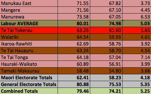 The average turnout in electorates held by National (in 2011) was 81.04% in 2008 and 75.48% in 2011. Turnout in Labour held (in 2011) general electorates was 80.01% in 2008 and 74.98% in 2011. The reduction between 2008 and 2011 in National electorates was, on average, 5.56 percentage points and 5.03% in Labour electorates.
If Ohariu (United Future) and Epsom (ACT) electorates are included in the ‘right’ then turnout in 2008 for the right was 81.11% and, in 2011, 75.63%. The decrease in turnout was 5.48 percentage points between 2008 and 2011.
So, on average, turnout in 2008 and 2011 in National held electorates was marginally greater than in Labour held electorates but the decrease in turnout was marginally greater in National held electorates than in Labour held electorates (remembering that the Maori electorates have not been included).
The simple conclusion from this last set of turnout figures is that turnout – and the reduction in turnout – between 2008 and 2011 was pretty much the same in ‘blue’ and ‘red’ electorates. It happened more or less nationwide.
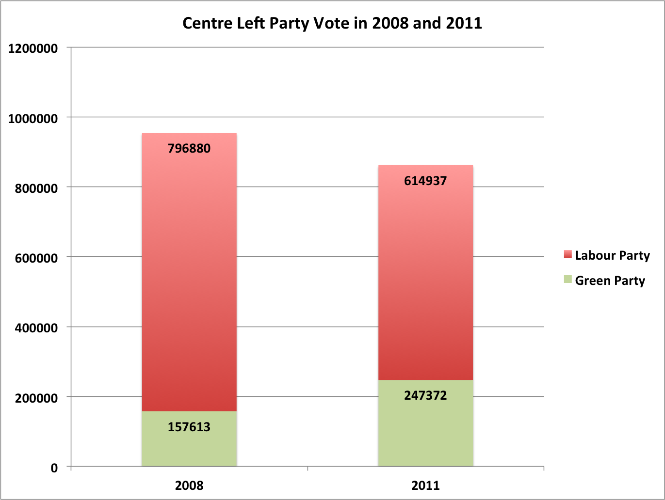
At the same time, total votes across the country for the left (Labour and Greens combined) took a dive:
In total, the combined Labour Party and Green Party vote – in absolute numbers – fell from 954,493 in 2008 to 862,309 – i.e., by 92,184 or 9.66%.
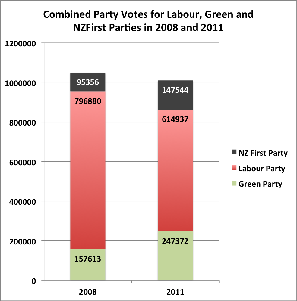
Even if NZ First’s vote is included on ‘the left’ the reduction is 39,996, as shown in the following figure:
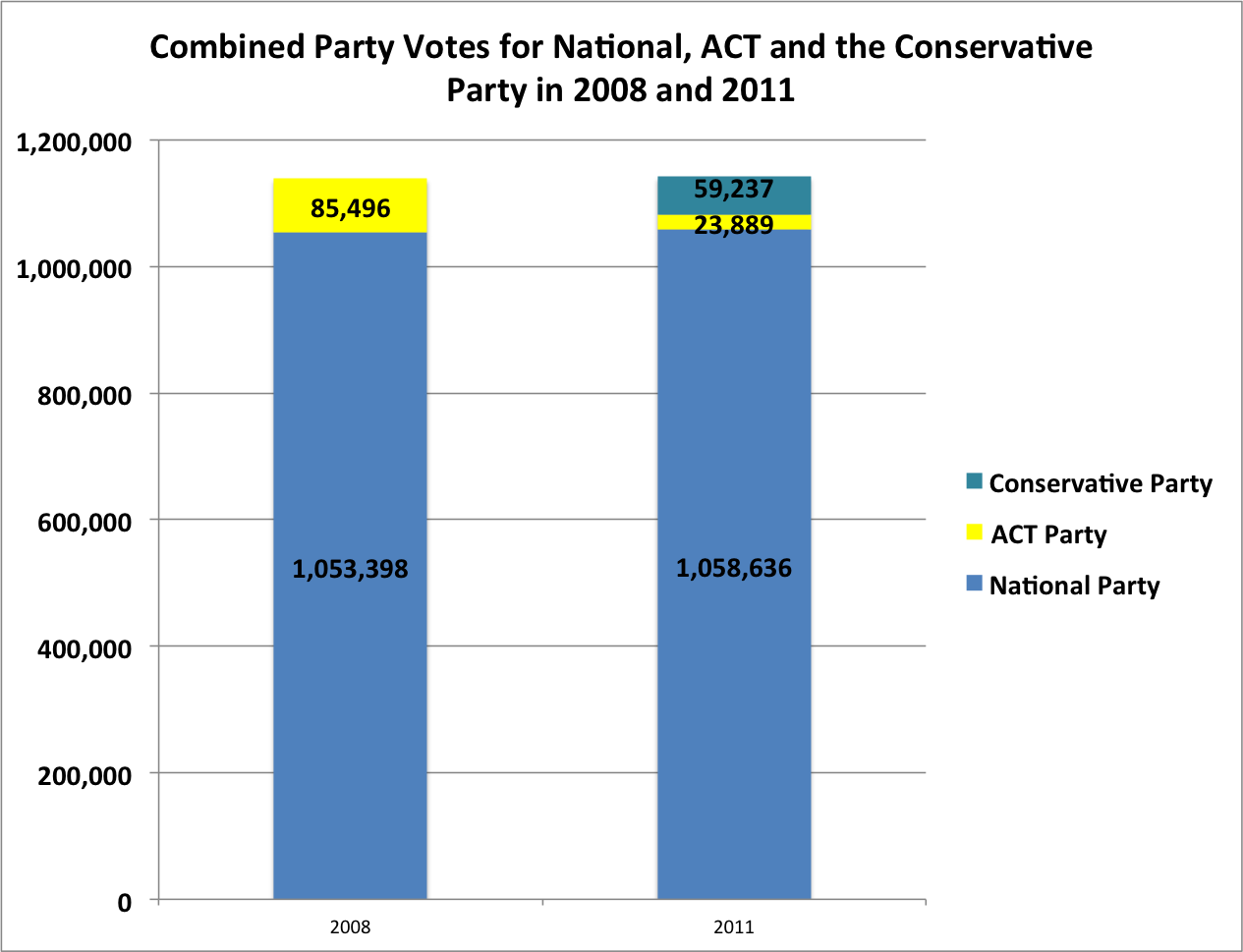
To finish the picture off, while the left (with or without New Zealand First) lost votes the right (i.e., National and ACT in 2008 and National, ACT and the Conservative Party in 2011) gained votes, in absolute numbers – from 1,138,894 in 2008 to 1,141,762.
Of course, in 2011 the vote for the Conservative Party was not represented in Parliament – and that relates to what I believe is the real problem for National (i.e., not voter complacency).
If complacency was the problem then it wasn’t to such an extent that it reduced National’s vote total. Surely that’s reassuring in the context of a reduction in turnout?
Here’s some final calculations – just for fun.
National’s vote in the thirteen ‘top’ performing electorates (in party votes for National) increased from 280,652 in 2008 to 288,169 in 2011. That’s a 2.68% increase.
The number of registered voters on the electoral roll, nationwide, in 2008 was 2,990,759. In 2011 the figure was 3,070,847. That’s an increase in the roll, nationwide, of – spookily – 2.68%.
Yes, I know. The roll in those 13 electorates, as I’ve already shown, increased by 4.9% (not 2.68%) between 2008 and 2011. Still, it can’t be a bad thing that the increased vote in those electorates pretty much matched the overall nationwide increase in the roll.
In order to have an overall increase in the roll, nationally, of 2.68%, the roll in non-true blue National seats must have increased by less than 2.68%. That means that National’s increased vote in its thirteen top electorates was proportionately greater than roll increases in the rest of the country.
Not so bad, then, for National?
No – unless there’s a slightly different explanation for the refusal of National’s vote to meet what, given Key and Joyce’s warnings at the conference, were obviously high expectations.
I think there is just such a more worrying – but better fitting – explanation for that ‘under performance’ in National’s vote in 2011.
The real worry for National
What does it all mean?
As I said at the start, without a survey of all 2011 non-voters in National strongholds it’s impossible to say definitively whether or not they were stacked with complacent wannabee National voters or voters of quite a different inclination.
The notion of ‘complacency’ suggests potential voters who were firmly of a mind to return the government but, through overconfidence, gave the polling booths the miss.
But a broader consideration of the likely make up of National’s high polling, leavened with the lessons from New Zealand’s electoral history, suggest quite a different explanation. Voters who, despite leaning towards National (or away from other parties) and perhaps avowing ‘National’ as the party they would most likely vote for in pre-election polling, may have ‘gone missing’ come polling day for the very simple reason that they were not that committed to National.
As a party starts to gain the kind of polling popularity that National has enjoyed over the last seven years – an ascent begun even earlier with Don Brash’s Orewa speech – it is inevitable that its appeal spreads to electors whose support is less ‘solid’ than a party’s core support. That is, it begins to colonise electoral land filled as much with danger and uncertainty as opportunity.
Or, to use another metaphor that would be familiar to anyone in Christchurch, as a city (i.e., a party) expands it starts to build on land that’s less solid, more unstable and shifting. A party may treat its new ‘residences’ on such land as just as solid and reliable as those in its traditional prime sites but the truth is that they just aren’t.
Each vote gained at those giddy heights of popularity is less reliable, less ‘in the bank’. It is increasingly on loan.
There’s a kind of political gravity, in New Zealand and in many other countries, that pulls ever harder the higher a party’s popularity ascends.
It acts as an electoral ‘glass ceiling’.
In New Zealand, that seems to kick in for any party that achieves over 40% or so in polling (and election results). The oxygen of stable electoral support gets pretty thin up there.
I think this is what is happening to National. And it’s a problem.
If there were in fact hundreds, thousands or even tens of thousands of National-leaning (and avowing) comprising the non-voters in 2011 it may well be that, if it were possible to look inside their heads, what would be seen would not be complacency.
More likely it would be a variation on the theme of “Well, if they’ve got that much support perhaps they don’t need me – and I’ve always been a bit ambivalent about supporting them so it lets me off the hook. If only Labour would get its act together!”
Or, “If they’ve got that much support then perhaps its better that I don’t vote for them – might make them arrogant. Still, I can’t bring myself to vote Labour or Green so that beach is looking better all the time!”
If even remotely correct, this interpretation is far more worrying than complacency. With complacency there is at least an assumed strong motivation to support the high-polling party. But if it’s more a case of a ‘low involvement’ commitment of support, ambivalence or, in the worst case scenario, the marginally better of two evils then targeting complacency may well miss the mark.
Worse still for National, it may well be a mark that in all practicality is not there to be hit.
I think that’s largely because we are in an MMP environment so actual support of over 50% is needed to form a government (even a minority government requires support of more than 50% on confidence and supply if it is to remain the government).
National is a single ‘brand’ – to use the slightly offensive terminology of today’s politics. It has successfully attracted to itself pretty much all of the possible support it can through employment of what amounts to a ‘supermarket brand’ product line. Expanding ‘brand loyalty’ further just isn’t a goer.
As many commentators have noted, putting all your eggs in one basket is a risky strategy because it effectively removes opportunities, through strategic alliances, to gather in supporters who would not actually vote for you but might vote for a party that acts as a ‘fellow traveller’. In an MMP world, that’s how stable governments get to be formed – in essence, through coalitions that represent more than one voter grouping.
For all the woes on the electoral left in New Zealand the big advantage it has is that it has managed to align two, maybe three, even four distinct voter groupings – ‘brands’ if you must.
The Labour Party, the Green Party, New Zealand First (well, it’s at least ‘oppositional’ if not ‘left’) and, now, the Internet Mana Party provide a diversity of ‘brands’ to which people with diverse loyalties can form attachments (voting intentions). And, potentially, in each case those attachments can be strong.
That is, each party can come to the ‘coalition’ (or ‘accommodation’) table with a more or less reliable core of support.
By contrast, on the right of New Zealand politics there has been a withering of ‘brand diversity’. In 2011 the natural consequence of that withering (electoral failure) was narrowly averted through opportunistic arrangements, notably in Epsom and Ohariu.
This time around, as Key and Joyce are no doubt fully aware, the calculation is even harder.
In response, National are clearly pursuing a double strategy to avert defeat this time. The first is about cultivating support options in a way that the public will accept.
That’s why John Key is now trying to sanitise such arrangements with ACT and United Future but even they may not be enough. What remain as opportunistic arrangements are now being cloaked in respectability through Key’s repeated reassurance that such electoral opportunism will now be announced explicitly and transparently. It’s hard to know why this would make them more acceptable but I suppose we all prefer honest thieves to those who deny wrongdoing.
Then there’s New Zealand First. It remains as an option, but problematically and unpredictably so.
Enter Colin Craig, stage right. It’s anyone’s guess how this particular gambit – on National’s part – will work out.
So there’s a Plan B. Or so it seems to me.
If you’re hitting a glass ceiling in your own support and you’ve tried just about every jury-rigging available then there’s only one option left – try to reduce the motivation of potential voters for your opponents to turn out.
It’s worth pointing out that, since the last election, one of the consolations for the left’s activists and supporters was that the lower turnout resulted from left-leaning voters staying home. That same analysis remains one of the main hopes on the left for a positive result in the coming election.
If I were a National Party strategist – which I’m not – I’d be doing my best to undermine that hope and, hence, the motivation to vote that it might generate.
If nothing else, National’s colonisation of the argument about the ‘missing millions’ must raise some doubt in the minds of those on the left that turning out at the polls may well change the government.
Perhaps I’m too cynical, but the final irony of the staged urgency over low turnout and voter ‘complacency’ at the National Party conference may well be that it was, at least partly, motivated to reduce turnout.
John Armstrong argued that the focus on ‘complacency’ was not actually meant for those National Party activists at the conference:
However, the party apparatchiks who are sent to the conference by their electorate organisations are the last people who need to be reminded of how close the election is likely to be – and thus how vital it is to get National-leaning voters to the polling booths.
The real audience for yesterday’s top-table lectures was those voters who think the September election is a foregone conclusion and they do not need to worry themselves as to whether they make it to the ballot box or not.
There is, however, a third audience for those “top-table lectures” – supporters of opposition parties, or at least those who may incline towards them.
The urban myth of National supporters basking at the beach secure in the knowledge that their preferred government will be returned – like all myths – can serve more than one purpose.
In that light, maybe John Key doesn’t need to hire new researchers.
If you’ve hit a glass ceiling then a myth of supporter complacency that can lower the floor for your opponents can make that ceiling irrelevant.


Ahhh, Puddleglum, I think we have both (1) precisely the same interests and (2) think along very similar lines. First, the Undecideds and now this ! I currently have a half-finished post (in draft) that I’ve been working on in bits and pieces over the last couple of weeks. And, although – unlike your incisive post here – my focus is entirely on explaining the consistent and significant overstatement of National support in the run-up to the last 2 elections, your ‘electoral glass ceiling’ thesis does come very close to one key aspect of my interpretation (although I’m going into a little more detail, employing different terminology and taking, perhaps, a slightly more multi-faceted approach). Luckily, then, it’s just a partial overlap – otherwise I’d have to give serious consideration to abandoning the draft ! But I gotta say, overall I read your post here with not only admiration but also a certain degree of trepidation as well ! I’m very relieved that you haven’t anticipated my ENTIRE argument, just part of it 🙂
Excellent analysis. (Incidently, have you seen Rob Salmond’s (very brief) response to the Key/Joyce thesis on 2011 turnout ?)
Hi swordfish,
Thank you so much for the comment. I have to say that I really admire the good thinking that you’re doing on analysis of the polls. Your one about undecideds in the Fairfax polls was inspirational for me.
Obviously do write your post!
All the best
Puddleglum